The idiom, ‘A picture paints a thousand words’ has been going since 1911, and it was never more true than in the world of data.

When I started out in my career as a junior marketer I sat through a LOT of needlessly long presentations. I saw a lot of slides. I saw a lot of data. Some 20 years ago many of those slides looked like this.
Along with the comment, ‘And it’s clear to see here…’. And it wasn’t just one chart. It was PAGES of them!
Presentation skills varied and some people helped you make sense of the numbers and the lines. Some made it more complicated, if that were possible.
Thankfully about 10 years ago I started to become increasingly aware of the world of infographics.
And I fell in love.
At that time I was working in an area of marketing involved with lots of data. On a daily basis I, and my team, would be talking to some of the best retailers in the world about their performance, their risks and their opportunities. These were busy people and if I wanted to convince them to take certain actions then I had to do this fast and in a way that wouldn’t be overturned by the next person in the door. Infographics helped us. We did it by cutting complex data down to one or two visuals and creating strong, memorable messages.
What is Data Visualisation?
According to TechTarget.com, “Data visualization is a general term that describes any effort to help people understand the significance of data by placing it in a visual context. Patterns, trends and correlations that might go undetected in text-based data can be exposed and recognized easier with data visualization software.”
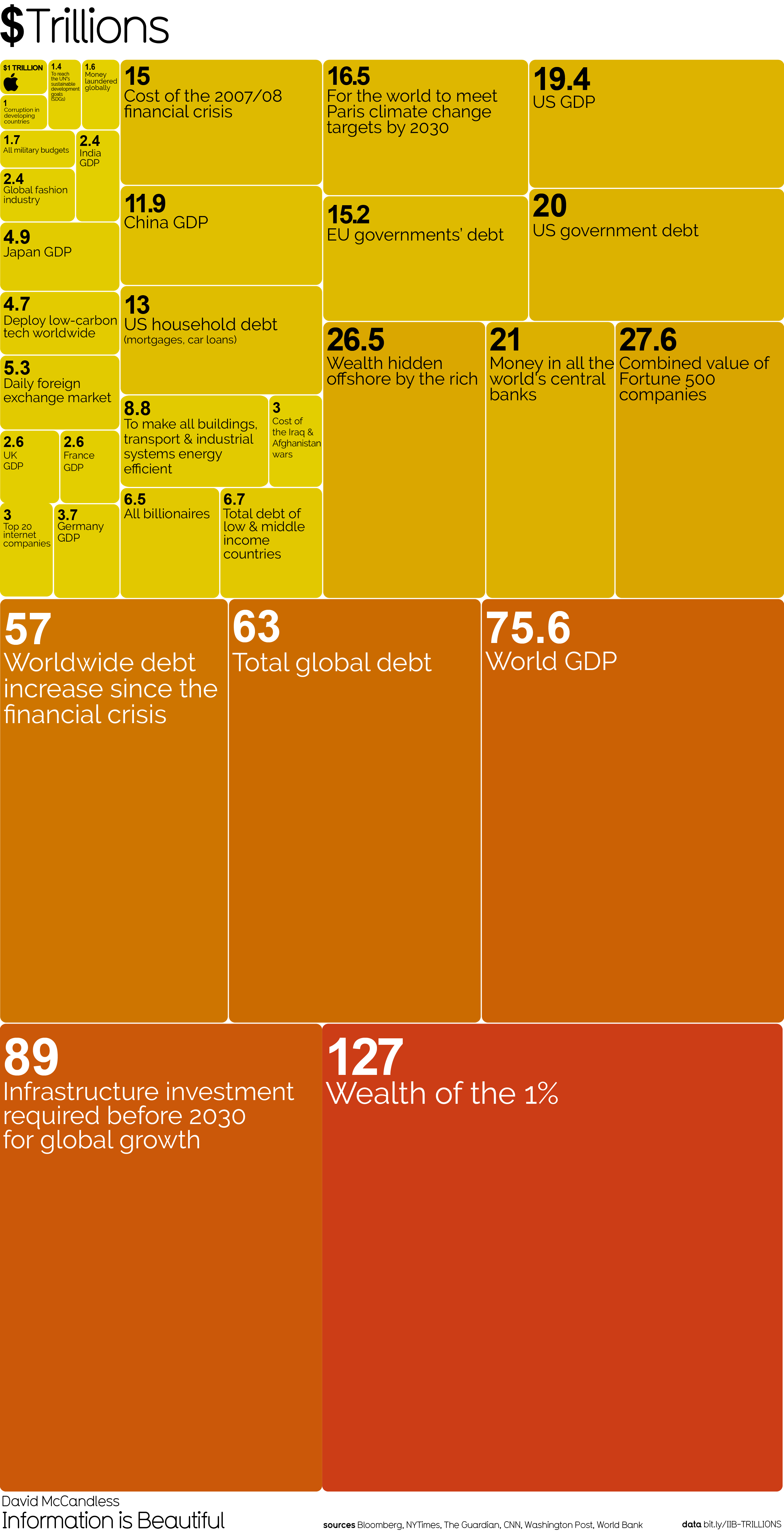
At a fundamental level it helps you understand information more intuitively. Take this for example. It’s hard enough to comprehend $Trillion, but understanding the wealth of the richest 1% is beyond most people’s grasp just from looking at the number. This helps.
They also can be very useful… like if anyone offers you a Romanian hangover cure, say “no”!
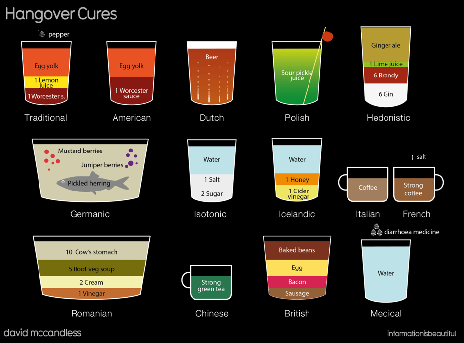
The best infographics not only convey meaning effectively but their styling can also convey the emotion of its subject.
The incredible Information is Beautiful team describe it perfectly as ‘Making data juicy’. Yum!
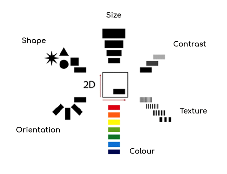
There was some very interesting work done by cartographer, Jacques Bertin. Jacques defined the 8 visual dimensions that apply to 2D visuals that he captured it in this clear visual.
You can see this beautifully applied in the next infographic. When you study the information being conveyed below, you can only imagine the pages of data tables that Samantha Shannon had to reference to create it.
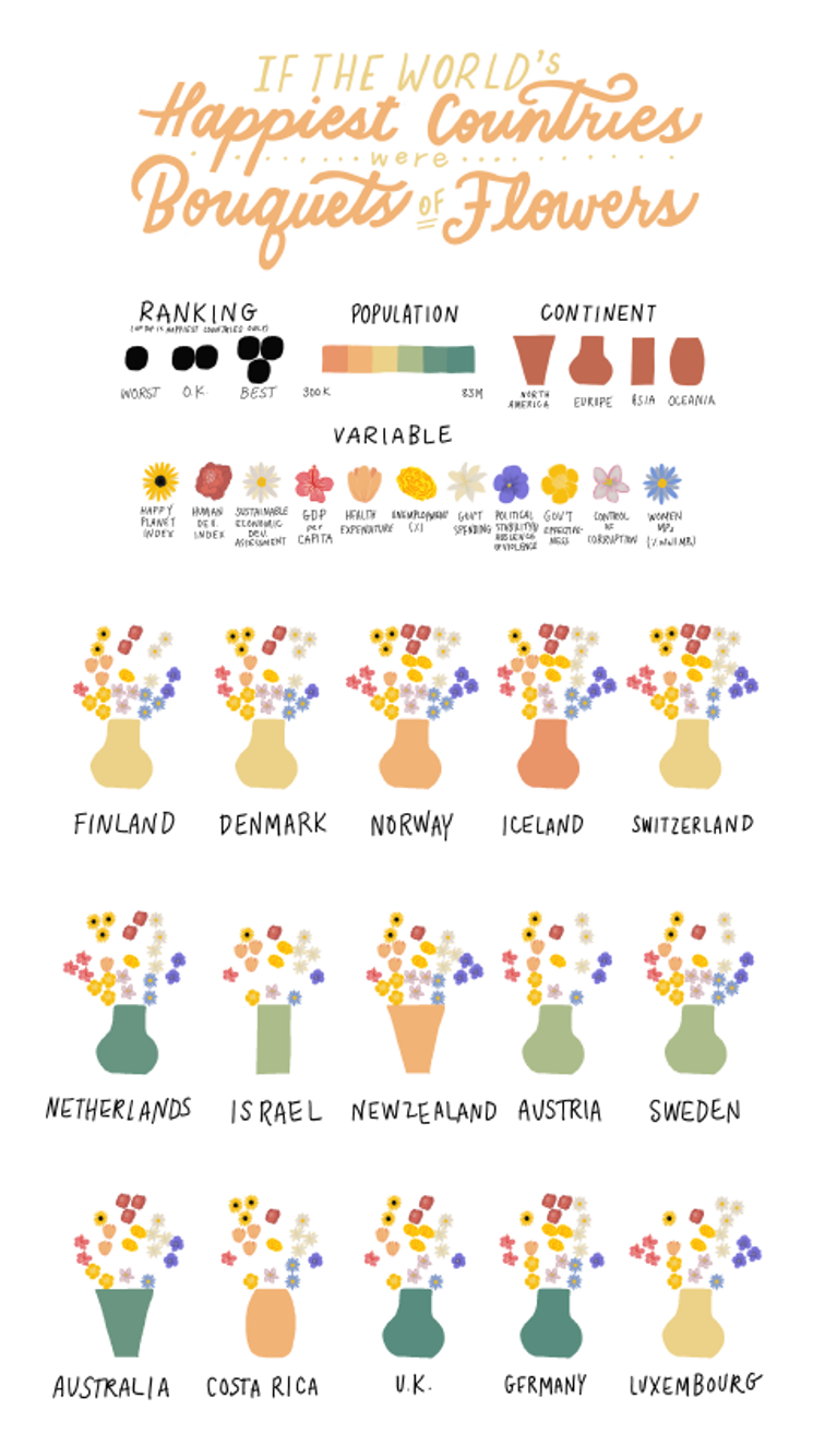
I asked Samantha what it was about data visualisation she loved so much.
“I love data visualisation, it breaks down barriers to non-technical audiences, who want to understand complex information in an engaging way. It also elongates our really short attention spans by inspiring people to take the time to explore a certain subject.”
Clearly, these examples are outstanding and incredibly inspiring and made by some very talented people with some great tools.
How can we use this approach in our day to day working lives?
The most important step is really giving thought to what information you are looking to convey and thinking through the various ways you could do that.
What makes the information most easily understood?
What makes it attractive to look at?
How much information are you trying to communicate?
If I remove the numbers does it still make some intuitive sense?
Get your creative head on and map out different ideas. In all cases, any software or artistic tools you have should be used to amplify your creativity rather than replace it, so this is an important first step.
There are some great tools out there, both free and paid, to make things easier for you.
Canva is a good tool to get started with. It has lots of templates and interactive elements. With Canva, I created this simple infographic last year. Another nice free tool is Visme, which includes some useful templates.
Tableau is a paid-for tool and is straight forward to use focusing on clear graphics with a wealth of options.
Whilst PowerPoint or Keynote are always improving, they are both still a long way behind some of the online presentation platforms. One of my favourites is Prezi. Like Canva, they offer both free basic tools and an enhanced premium version. Simple to use, create and customise, you can offer your audience a richer experience and deliver your message better with their higher engagement levels.
Of course, this all takes more time than “thinking in PowerPoint” or writing a paragraph, but the end product is more engaging, more enjoyed, and most importantly recalled more readily.
Infographics in a cybersecurity world
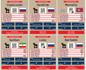
Back in the world of cybersecurity, I wanted to turn this table of information into something more visual to understand.

The end product is below. I created these cards to give easier comprehension and an ability to easily make comparisons. Perhaps too, a more enjoyable way of understanding and comparing these ransomware outbreaks.
When infographics go wrong
So far so easy, right?
But it needs to be thought out.
As we saw above colour choice should help the data make more intuitive sense.
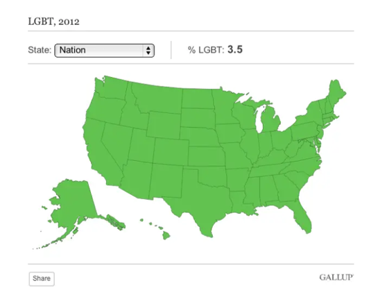
In this next infographic Gallup has conducted a poll to understand the percentage of LGBT individuals in each state. Unsurprisingly, all of the states were rather close (ranging from 1.7% to 5.1%). The system they had used to colour code their graphic meant that the whole map was green! Not especially insightful!
Pie charts should add up to 100% (and who needs 2 decimal places?!)
And finally, just because you can doesn’t mean you should.

Where to go from here:
Hopefully, you have been inspired by the joy and power of infographics! However, if you want to create one, where could you go from here?
- Take a look at the last lot of data you presented. Is there a way you could have done this that might be more engaging for your audience and provided richer insights?
- Do you have a colleague who has a passion for graphics that you can discuss this with and come up with ideas about how to better convey the messages?
- Is there someone in the team interested in training up in this area? Show them some of the resources they can use and the date and message you want to convey.
- Consider outsourcing key data communications to get an expert to look at developing your infographic.
- When it’s developed, share it with some trusted colleagues. Does it make sense to them? What key messages are they seeing?
- Get some feedback afterwards. Refine and improve your communication for next time.
Final thoughts
Steve Jobs said, “Simple can be harder than complex. You have to work hard to get your thinking clean and simple. But it’s worth it in the end because once you get there you can move mountains’.
Some great further reading on data visualisation and infographics:
Information is Beautiful, particularly the regularly updated Beautiful News
Junk Charts
Fundamentals of Data Visualization: A Primer on Making Informative and Compelling Figures

